


Brand
Guidelines
This guide defines the visual language, design style, and principles that shape a clear and consistent brand experience, no matter the team or area of expertise.
At its core, Redo is about precision and clarity—just like our mission to correct financial errors and optimize balance sheets. This guide lays out the essential design standards that bring our brand to life, from our color system and typography to accessibility benchmarks and documentation.
Whether you're designing for digital platforms or printed materials, these guidelines ensure every touchpoint reflects the trust and efficiency at the heart of Redo.
03
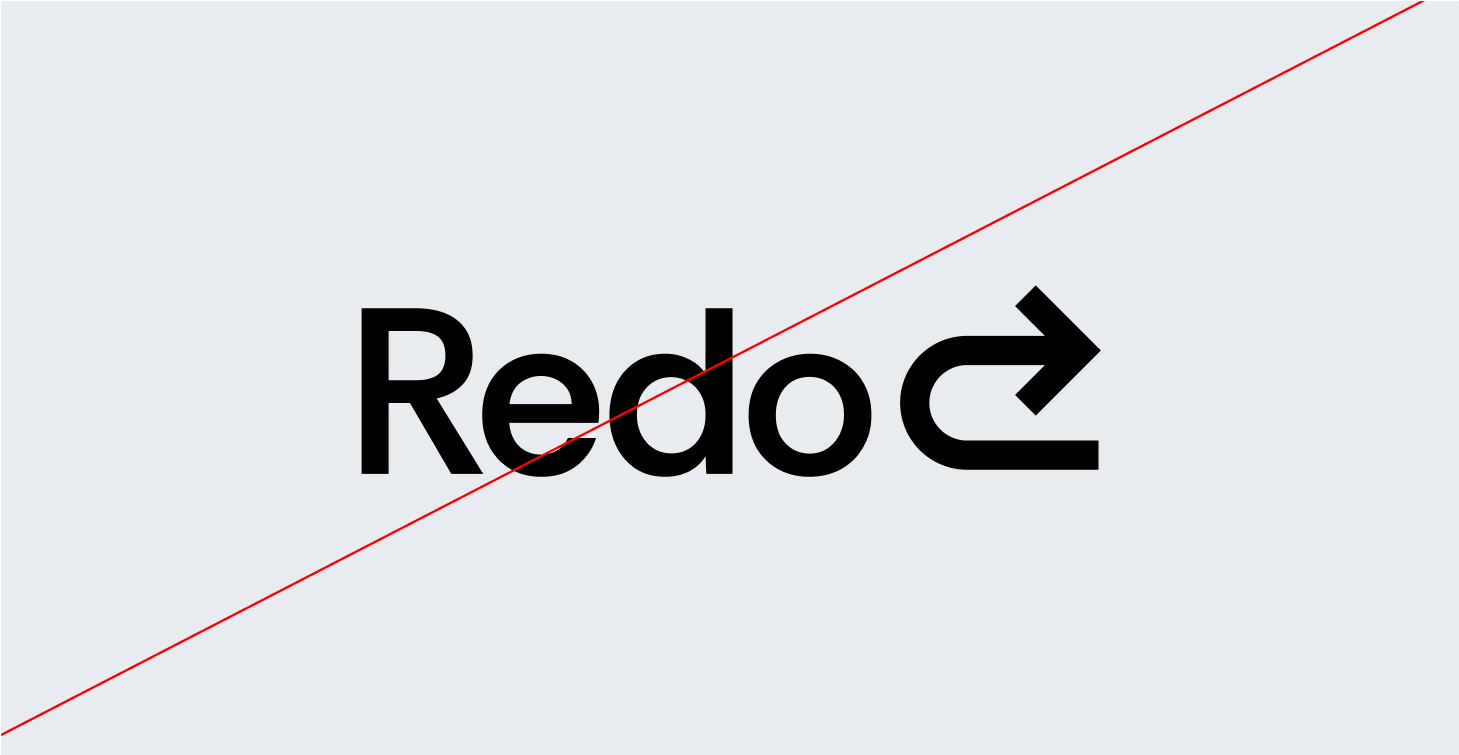
Logo
The Redo logo is a sleek, modern arrow that curves backward, symbolizing the power to rewind, correct, and optimize financial decisions. The reversed motion represents our core mission—helping businesses go back, fix errors, and recover lost value.
Designed with clean, sharp lines, the arrow conveys precision and efficiency, while its fluid motion suggests agility and adaptability in financial correction. The color palette reinforces trust and clarity—deep blues or greens for stability, complemented by bold accents to signify action and resolution.
More than just a symbol, the Redo logo embodies our commitment to turning financial missteps into opportunities for growth—because tin business, every mistake deserves a second chance.
3a
Primary Logos

Logomark
Primary


Another way to refer to Ynput is our mark. The logomark is used in instances where there isn’t enough room for the full logo—for example, an application icon or favicon.
3a
Primary Logotype
3b
Safe zones
3c
Alternatives


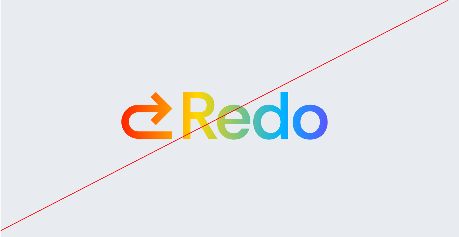
Logo
Alternatives
Two colour alternatives are always preferred, but if need be you can also use a monochrome variant.


Logomark circle
Alternatives


Use circlular logomark for profile pictures and in places where crop and background is important
3d
Incorrect Usage

Do not resize the mark
Do not rotate the logo
Do not change the color of the mark alone
Do not outline the logo
Do not reverse the lockup
Do not add gradients the logo
3e
Partnerships


partner
04
Color
Redo’s color palette is designed to evoke trust, reliability, and financial clarity, ensuring that every touchpoint reflects our commitment to accuracy and efficiency.
Together, these colors create a strong, dependable, and forward-thinking brand identity, ensuring that Redo is instantly recognized as the go-to solution for financial corrections and optimization.
3a
Primary Palette
Ynput Mint
Hex: #FA9819
UI Grey 90
Hex: #B6C9CF
White
Hex: #000000
Baby Mint
Hex: #C6EBF7
3a
Secondary Palette

Yellow
Construct Yellow
Hex: #1E3D59

Code Blue
Hex: #1E3D59

Error Red
Hex: #1E3D59

Baby Mint
Hex: #1E3D59

Construct Yellow
Hex: #1E3D59

Baby Mint
Hex: #1E3D59

Code Blue
Hex: #1E3D59

Error Red
Hex: #1E3D59

Baby Mint
Hex: #1E3D59

Baby Mint
Hex: #1E3D59
05
Typography
Redo’s typography balances clarity and professionalism with a modern yet timeless type pairing, reinforcing our commitment to accuracy, efficiency, and financial stability.
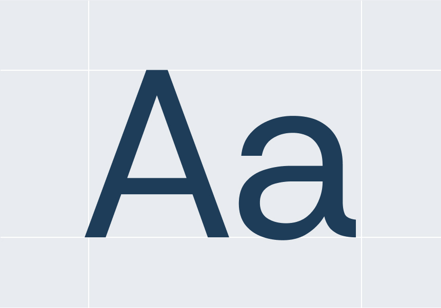
Primary Sans-Serif (Rethink Sans Reg) is a clean, modern sans-serif typeface that ensures legibility and precision across all digital and print materials. Its geometric structure reflects clarity, efficiency, and trust, making it the ideal choice for data-heavy content, dashboards, and user interfaces.
Secondary Serif (Hedvig Letters Serif) is a refined, authoritative serif font that adds a touch of tradition and credibility. Used for emphasis in headlines, reports, and financial documents, it reinforces Redo’s expertise and reliability in correcting financial discrepancies.
This sans-serif and serif combination creates a dynamic contrast—modern yet trustworthy, analytical yet approachable, ensuring Redo’s brand communication is always clear, professional, and dependable.
- Primary Typeface
Rethink Sans Reg
- Secondary Typeface
Hedvig Letters Serif
5b
Sizing
Lorem ipsum dolor sit amet, consectetur adipiscing elit, sed do eiusmod tempor incididunt ut labore et dolore magna aliqua. Ut enim ad minim veniam, quis nostrud exercitation ullamco laboris nisi ut aliquip ex ea commodo consequat.
Clear Up Confusion, Gain Peace of Mind
Type Sizes > 72pt/px
100% Leading
-2% Tracking
Whether it’s a bank error, an unauthorized charge, or an overlooked refund, we ensure you don’t pay for something you shouldn’t have.
Type Sizes 55–72pt/px
110% Leading
-2% Tracking
Our team works diligently to recover lost funds, correct inaccuracies, and keep your financial records accurate—so you can feel confident about every dollar in your account.
Type Sizes 24–55pt/px
120% Leading
-1% Tracking
Financial errors shouldn’t slow you down or cause unnecessary stress. Whether it’s an incorrect charge, a duplicate transaction, or a miscalculated fee, we step in to make things right. Our process is simple, straightforward, and designed to get your money back where it belongs—quickly and without hassle.
Type Sizes 0–24pt/px
130% Leading
0% Tracking

© Redo
Legal
Privacy
All Rights Reserved

Brand guidelines

